The Complete Guide to UI/UX Onboarding: Research-Backed Best Practices
A deep, structured, research-anchored dive into UI/UX onboarding that synthesizes current best practices, psychology insights, expert research, and real product examples.

Onboarding UX: A First-Principles Deep Dive
From first contact to real value without friction, overload, or theater
The Core Thesis (anchor everything here)
Onboarding is not education. Onboarding is value acceleration.
If a user understands your product but doesn’t experience value, onboarding failed.
If a user experiences value without fully understanding the product, onboarding succeeded.
Everything below serves this single objective:
Minimize the time between first interaction and the first “aha”.
The Real Problems Onboarding Must Solve
Almost all onboarding failures collapse into two distinct cognitive problems:
- Timing: When information appears
- Load: How much information appears
They are related, but not the same. Treating them as one is why many onboarding flows feel bloated or patronizing.
Problem 1: Timing: Information Delivered Before Intent Is Wasted
The Insight
Humans do not store instructions abstractly. We encode knowledge in context of action.
Information delivered before the user needs it:
- Is skimmed
- Is forgotten
- Competes with motivation instead of supporting it
This is why:
- Welcome tours are skipped
- Multi-screen intros have near-zero recall
- “Here’s everything you can do” screens don’t work
The Principle
Information should be triggered by behavior, not by entry.
Onboarding should react to what the user does, not what you want to explain.
Pattern: Just-in-Time Guidance
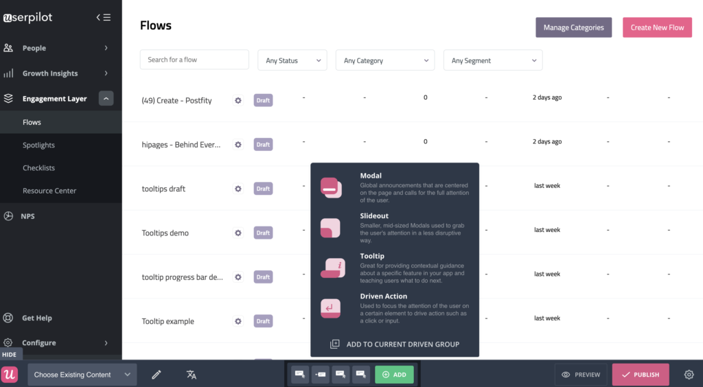
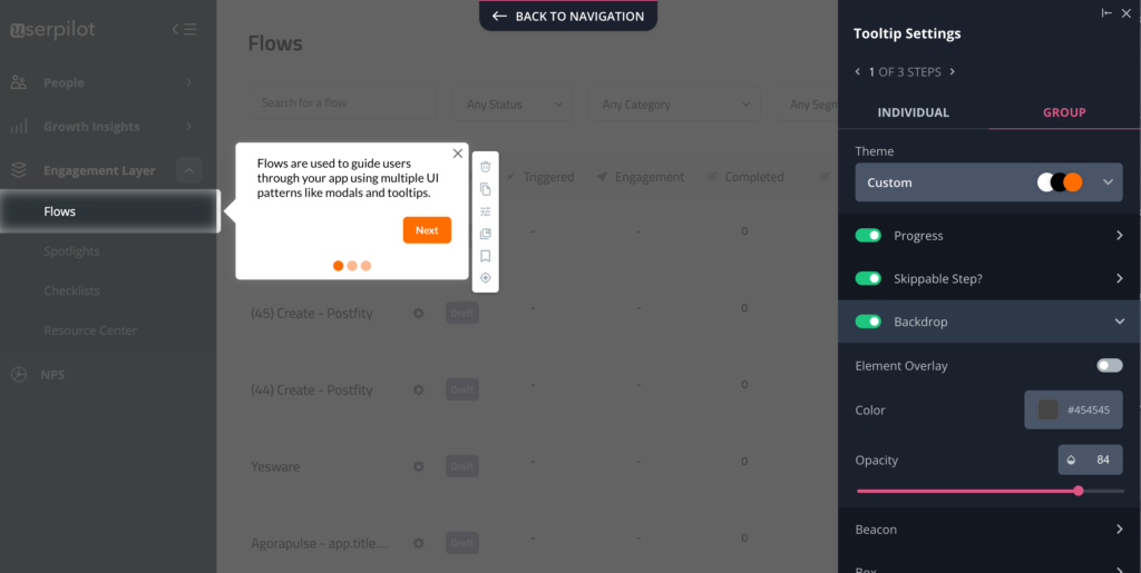
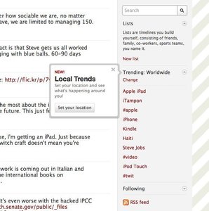

What works
- Tooltips that appear after interaction
- Inline hints tied to UI focus
- Error-driven micro-explanations
What fails
- Full product tours
- Modal-heavy walkthroughs
- Static “how it works” pages at the start
Problem 2: Load: Too Much Too Early Creates Paralysis
The Insight
Even perfectly timed information fails if complexity is revealed all at once.
Human working memory is limited. Overexposing power creates:
- Anxiety
- Decision paralysis
- Premature churn
This is not about intelligence; it's about cognitive bandwidth.
The Principle
A product should feel simple today and powerful later.
Users don’t need the whole system. They need the next useful step.
Pattern: Progressive Disclosure

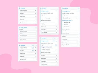
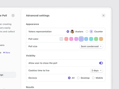
What works
- Hiding advanced options initially
- Unlocking depth after success
- Gradually increasing surface area
What fails
- “Advanced” dashboards on day one
- Dense configuration screens
- Expert-level defaults for beginners
Why Timing ≠ Load (important distinction)
| Dimension | Timing Problem | Load Problem |
|---|---|---|
| Core failure | Info arrives too early | Too much info at once |
| Symptom | Skipped tours | Overwhelm |
| Fix | Contextual triggers | Gradual exposure |
| UX smell | Intro modals | Dense first screens |
Most products fail because they solve neither well.
From Problems to Patterns (What Actually Works)
Once timing and load are controlled, onboarding becomes about designing momentum.
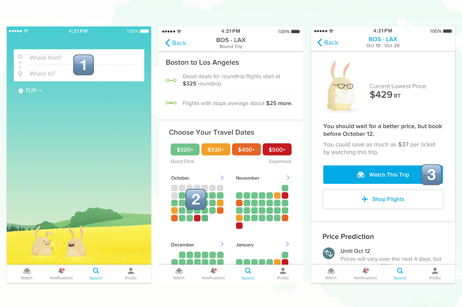
Pattern 1: Learning by Doing (Action Beats Explanation)
Insight
Users don't learn products; they form muscle memory.
Understanding follows action, not the other way around.
Pattern: Interactive First Task

Strong implementations
- Pre-filled demo data
- Sandbox environments
- “Try this now” flows
Rule
If the user hasn’t done something meaningful in the first minute, onboarding failed.
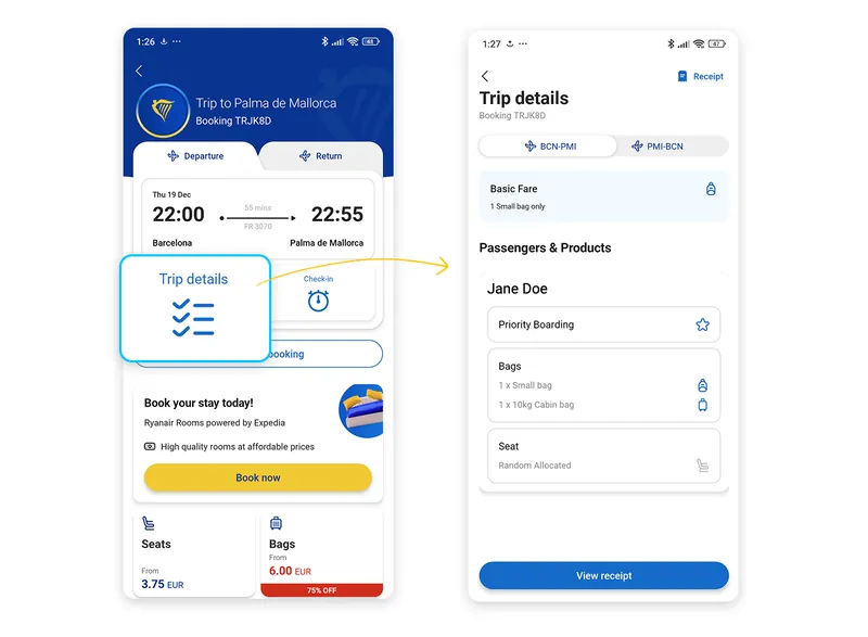
Pattern 2: Empty States as Teachers
Insight
The first empty screen is a decision moment, not a neutral state.
Without guidance, users stall.
Pattern: Instructional Empty States
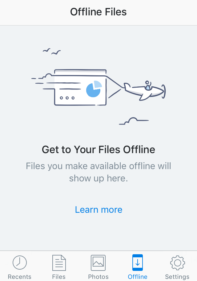


Good empty states
- Explain what belongs here
- Suggest the next concrete action
- Reduce ambiguity
Bad empty states
- “No data yet”
- Blank dashboards
- Passive placeholders
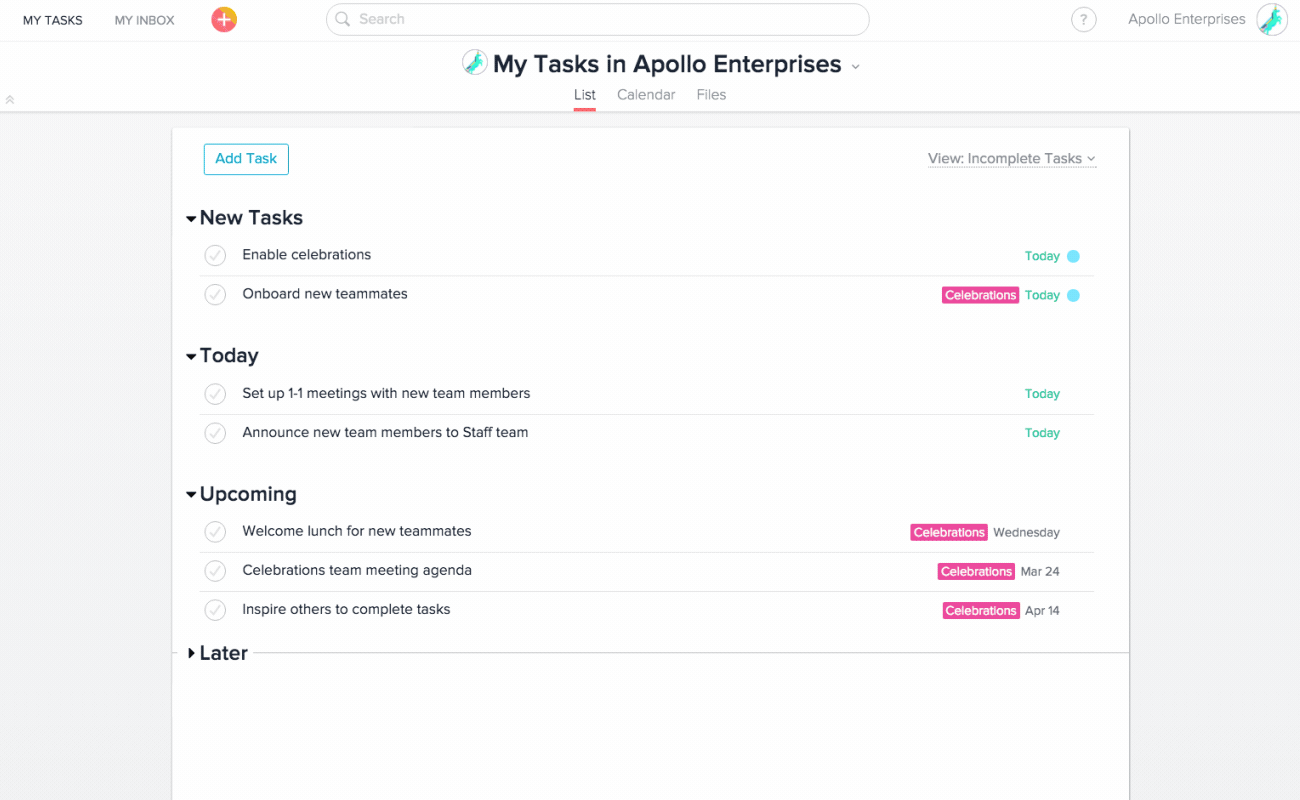
Pattern 3: Progress Creates Psychological Momentum
Insight
Visible progress reduces anxiety and increases completion.
Humans are wired to finish what looks finishable.
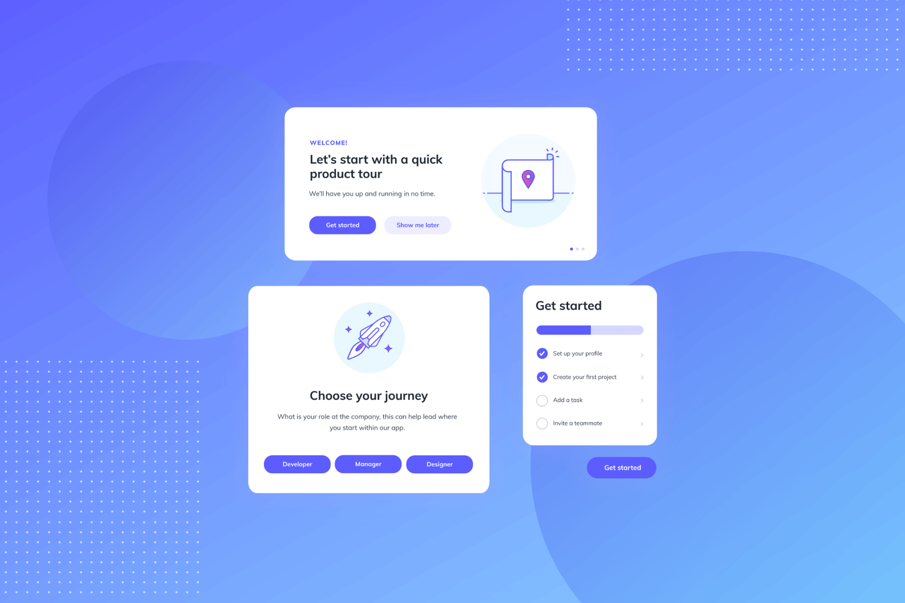
Pattern: Checklists & Progress Indicators
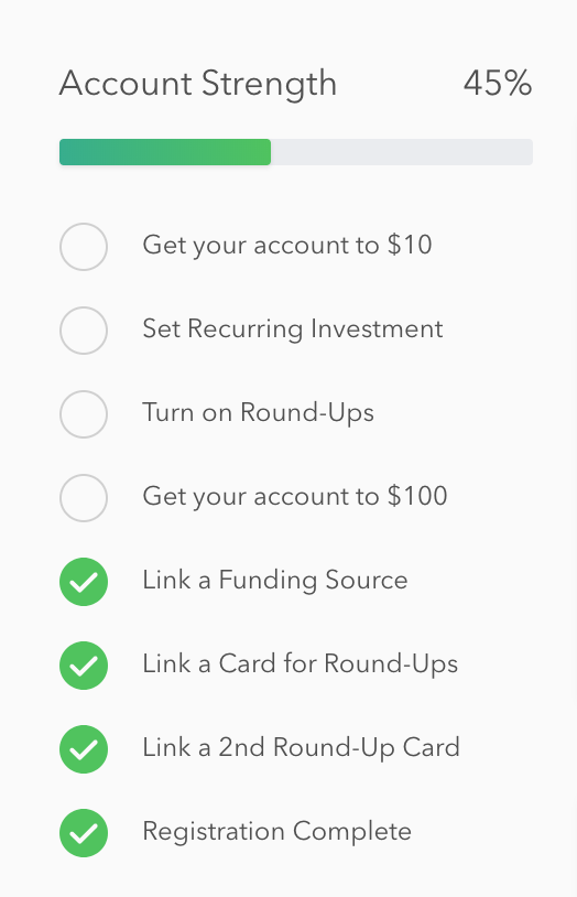
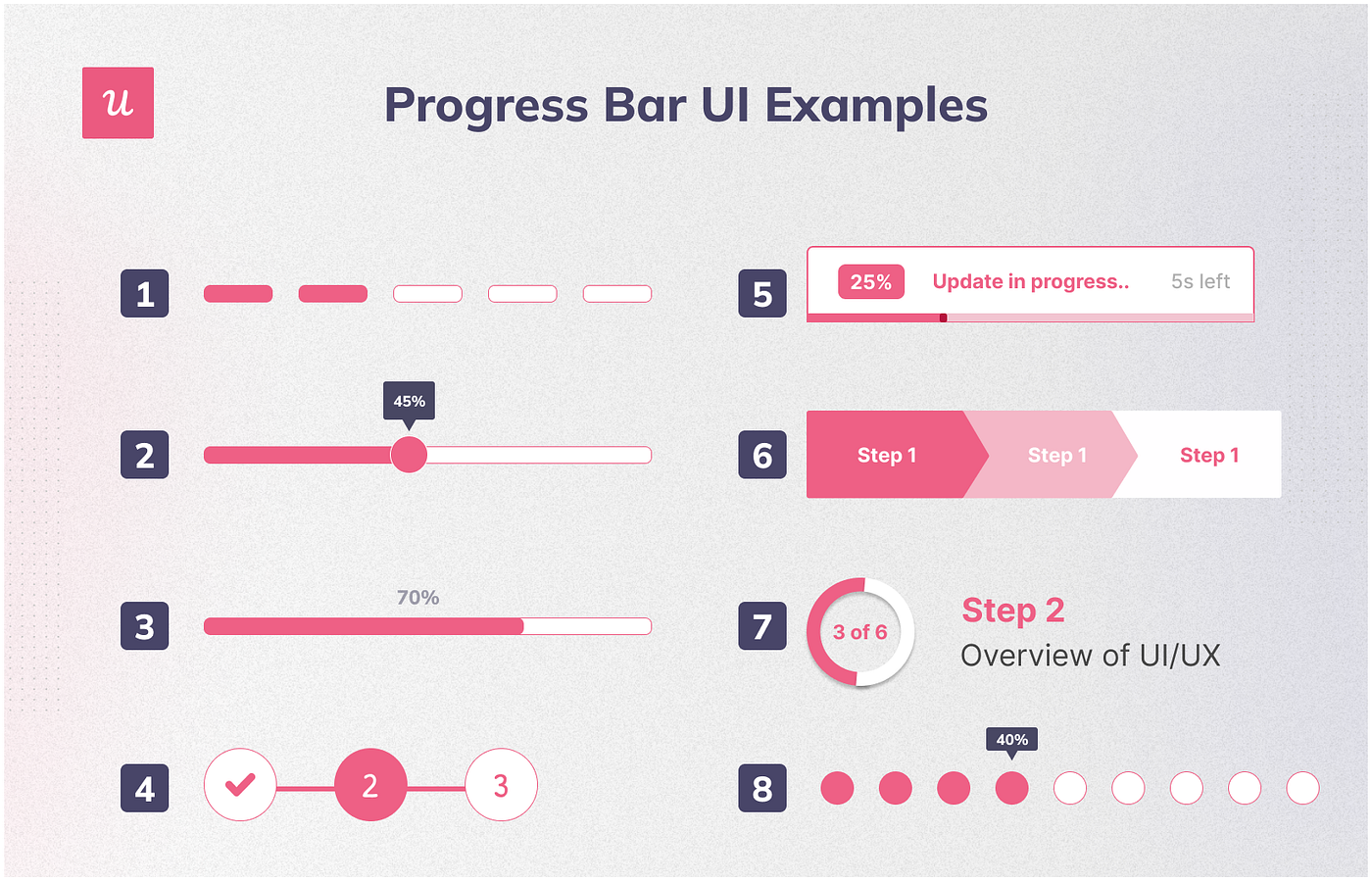
Why it works
- Converts ambiguity into structure
- Makes onboarding feel finite
- Turns setup into achievement
Critical constraint
Progress must map to real value, not cosmetic steps.
Pattern 4: Personalization Without Interrogation
Insight
Personalization increases relevance, but only if friction stays low.
Pattern: Lightweight Intent Capture


Best practice
- 1–2 high-signal questions
- Immediate UI adaptation
- No long surveys
Anti-pattern
- Multi-step questionnaires before value
Pattern 5: Escape Hatches Build Trust
Insight
Users resent being forced more than being confused.
Control signals respect.
Pattern: Skip / Expert Mode


Why it matters
- Experts move faster
- Forced flows increase abandonment
- Autonomy increases trust
Measuring Whether Onboarding Works
Onboarding is not a design artifact; it's a funnel.
Track:
- Time to first meaningful action
- First-task completion rate
- Drop-off per step
- D1 / D7 retention correlation
If onboarding doesn’t improve these, it’s decorative.
The First-Principles Summary
Great onboarding
- Optimizes time-to-value
- Respects cognitive limits
- Teaches through action
- Adapts to user intent
- Preserves autonomy
Bad onboarding
- Explains before enabling
- Overloads early
- Treats all users the same
- Blocks value behind process
Where to Learn More (Resources)
Research
- Nielsen Norman Group: onboarding, cognitive load, tutorials
- UX Design Institute: onboarding best practices
Pattern Libraries
- Mobbin: real onboarding flows
- Appcues: onboarding pattern breakdowns
- Userpilot: onboarding pattern breakdowns
Behavioral UX
More